
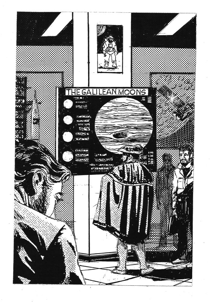
In the 1950s and 60s, the classic space art was dominated by the late Chesley Bonestell, particularly his paintings for Willy Ley’s The Conquest of Space (1950), Across the Space Frontier and Man on the Moon, edited by Cornelius Ryan (1952 and 1953), The Exploration of Mars by Willy Ley and Wernher von Braun (1956), Beyond the Solar System by Willy Ley (1964), Man and the Moon edited by Robert S. Richardson (1961), and Richardson’s own Mars (1965). They can’t be reproduced for copyright reasons, but they inspired the other artists below.
Much of the work was created for magazines such as Life, Coronet, Mechanix Illustrated and particularly Collier’s, and relatively recent online reproductions of those articles have made that artwork accessible. Many of the black-and-white images in the books turn out to have been originally in colour for the magazines. In 1979, the Scottish Arts Council financed me to make a whirlwind tour of US space centres, gathering material for ‘The High Frontier, A Decade of Space Research 1969-79’, the largest spaceflight exhibition in the UK to date, for the tenth anniversary of the Moon landing, held at the Third Eye Centre (now the Centre for Contemporary Arts). One of my first ports of call was the Smithsonian Air & Space Museum in Washington DC – an amazing experience in itself, but when I was taken to the offices upstairs, I found the corridors were hung with Bonestell originals. Many were ‘roughs’ or unfinished versions, revealing how much work had gone into the published ones, but also how many of the black-and-white images in the books were originally in colour, in addition to the colour plates in the books themselves.
(I was a little disappointed by the response from the Smithsonian, principally an A4 set of high-quality Apollo 11 images. We integrated them with a larger set supplied by Kodak, and displayed them along with reproductions by Hasselblad of the cameras used on the Moon. I mentioned the exhibit in ‘Galileo at the High Frontier’, a time-travel story commissioned by the CCA, published in Laura Smith, ed., To Arrive at Where We Started, CCA, August 2012, and reprinted in my collection The Elements of Time (Shoreline of Infinity, 2016), with an illustration by Sydney Jordan (Fig. 1).

More recently a large number of Bonestell paintings have been published on Italian websites, sometimes briefly. The Italians rate graphic art much more seriously than we do, but copyright, sometimes, rather less. When my Children from the Sky came out, illustrated by Sydney Jordan, an Italian journalist hacked into a supposedly secure website and told me he would publish all the images without permission. I protested to his editor and got the article spiked. But at the time, the Jeff Hawke Club’s reprinting of Sydney Jordan’s work had reached Lance McLane, the alternative version of Jeff Hawke published by the Daily Record. For my Notes on the stories, I was looking for an explanation of why Sydney had named a planet orbiting Epsilon Aurigae ‘Anachoreta’ (see ‘Winter and Spring Stars 2’, Fig. 8, ON, January 23rd, 2022). On one of the Italian websites, I came across three Bonestell paintings, one of which was of Epsilon Aurigae, which was then thought to be a very large, diffuse giant star. Bonestell painted it that way twice, in 1948 and again for Beyond the Solar System above. But the page was headed ‘ANCORATRE BONESTELL’ ‘Anachoreta’ is Italian for a hermit (anchorite) or mystic, which made sense for ‘the Planet of the Magicians’. But was it a modern name for the star which Chesley Bonestell had used and Sydney Jordan had picked up? Luckily, I pressed ‘translate page’ before making a mistake which would have amused Italian readers of Jeff Hawke’s Cosmos and probably some Orcadian ones as well.. ‘ANCORA TRE BONESTELL’ (three words) is Italian for ‘Three More Bonestells’.
In the 50s, the British counterpart to Chesley Bonestell was R.A. Smith, who produced a collection of about 140 drawings and paintings before his death in 1959, when they were purchased by the British Interplanetary Society. Several had appeared in black-and-white in Arthur C. Clarke’s first nonfiction book, The Exploration of Space (1951) – see ‘Jeff Hawke, First Citizen of the Space Age’, Fig. 11, ON, October 15th 2023. A more comprehensive collection was published as The Exploration of the Moon (Muller, 1954), with full-page plates and accompanying text by Clarke (see ‘The Need to Save Chandra’, Fig. 15, ON, June 30th 2024). Only seven of the plates were in colour (see ‘The Earth from Space’, Fig. 4, ON, 7th May 2023), but the cover was one which was black-and-white inside (Fig. 2), suggesting that most if not all of the rest might be too.

All the Smith illustrations in Bob Parkinson’s High Road to the Moon (BIS, 1979) were in black and white, shedding no light on the matter, but occasional reprints by the BIS since have shown that at least some of them were in colour (see ‘Spacesuits’, Part 1, Fig. 10, ON, 24th September 2023). Two such appear in ‘Take the High Road’, a retrospective review of High Road to the Moon in the current issue of the BIS Space Chronicle (July 2024). The colours are even more subtle than in Ed Buckley’s ‘Marius Hills City’, printed here last week, and my scanner has struggled to catch them, but they’re there. The last of them is the last one in The Exploration of the Moon, which Clarke captioned only as ‘The Price…’ (Fig. 3). As he said elsewhere in The Challenge of the Spaceship, that price ‘will be remembered when all the billions of dollars and roubles are just meaningless entries in duty ledgers’.

Another artist much influenced by Chesley Bonestell and R. A. Smith was Fred L. Wolff, who illustrated books for Martin Caidin, later the author of Marooned and creator of The Six Million Dollar Man. His cover illustration for Caidin’s Worlds in Space (1954) shows a von Braun type space station, made famous by Bonestell, accompanied by R.A. Smith type ‘ferry rockets’, now called ‘space shuttles’ (Fig. 4). All of his illustrations for Rockets through Space (1952), Worlds in Space and Race for the Moon (1960) are in black and white, and I have not been able to find any of his work online except for scans from the books. He did produce striking colour covers for Caidin’s first novel, the first version of Marooned (Fig. 5 – see ‘Mercury Capsule’, Fig. 13, ON, August 21st 2022), and for Rendezvous in Space (1964, Fig. 6 – see ‘Rocket Aircraft Part 2 – Wings into Space’, Fig. 11, ON, December 3rd, 2023), so it would be interesting to find out if the interior plates were in colour and can be retrieved.


Another artist similarly influenced, at least in his early years, was David A. Hardy, whose first published work as a teenager was a black and white cover illustration for a book by Patrick Moore (Fig. 7).

He went on to work with Patrick throughout the latter’s working life, for instance on books like The Challenge of the Stars and The Next 50 Years in Space, as well as huge amounts of illustration for spaceflight, astronomy, science fiction and fantasy book jackets, magazine covers and much more, all of which is in colour, as far as I know from his website and other sources. Sometimes, inevitably, only black-and-white reproduction was available. There’s one such in Ian Ridpath’s book Worlds Beyond (1975), illustrating Freeman Dyson’s concept of growing trees on comets, which David doesn’t even remember. When I asked him about it, he immediately produced two more on the same theme for me (Fig. 8). Another for me contrasts the natural and artificial possibilities of the interstellar object ’Oumuamua – see ‘’Oumuamua, Part 1’, Fig. 5, ON, 17th December 2023.


After the Moon landings David produced a hommage to Chesley Bonestell entitled ‘The Way It Should Have Been’, with the mountains jagged as they were thought to be until the landings (Fig. 9). The late Chris Boyce bought a print of it to donate to ASTRA, and it appeared at our exhibition for the 40th anniversary of the Moon landing, in Hillhead Library, 2009, and afterwards at the Museum of Country Life, above East Kilbride. David kindly gave me a high-resolution scan of it to use on the cover of our journal Asgard in 2001, but it’s not been here before. Eventually I discovered that there actually was such a painting by Bonestell, in an offprint from the Encylopedia Britannica, with the mid-60s design of the Lunar Module and the astronauts in Project Gemini suits, which may well have been based on photographs of them in training in the National Geographic Magazine – see ‘Spacesuits, Part 2’, Fig. 4, ON, 1st October 2023.
As the creator in 1954 of what became the world’s longest-running comic strip, Jeff Hawke, with a continuation in the Daily Record called Lance McLane, 10,209 episodes in all, Sydney Jordan too was much influenced by Chesley Bonestell, especially in the first five years. It left him little time for colour work, and he once told me that it felt as if his life until the strip ended in May 1988 had been dominated by black-and-white squares. In December 1979 Lance McLane went into colour in the Daily Record, but the colouring was done by the paper. Sydney had mixed feelings about it, as did many readers, because the Film Noir effect he had been striving for was lost. When I was asked to help with compilation of the book Jeff Hawke, Lance McLane/2, which completed the publication of the strips in Italy (Fabio Manini, ed,, Rosellini’s Foundation of Popular Literature, Senigallia, November 2014), in scanning the newspaper strips and tweaking brightness and contrast to get a consistent quality, I discovered that the colours were actually much better than newsprint had allowed. The Record almost always got them right, but there was one spectacular exception. Sydney had previously done a black and white drawing of the starbow effect, which would be seen from a spaceship approaching the speed of light. Due to aberration the stars would appear to cluster ahead of it, forming rings of colour, blue at the centre and red at the edges, due to Doppler effect. Gavin Roberts had painted the preliminary ‘star barrel’ effect for the cover of Man and the Stars (1974, Fig. 10), although the 3-D effect was muted by the printers’ cropping the reddest stars at the edges. Sydney asked me to supply a story which would let him depict the effect in colour, and I obliged with ‘The Nest of the Phoenix’ (2013), but the Record misunderstood and printed the star barrel in monochrome brown, both on the outward journey and on the way back.

Sydney was of course perfectly capable of working in colour himself, as had been shown by his covers illustrating Venus Plus X, by Theodore Sturgeon, for New Worlds in 1961. In 1989, the year after the strip ended, he did the cover for Starfield, Science Fiction by Scottish Writers, which I edited for Orkney Press, and in the mid-1990s he began to illustrate my Children from the Sky. Most of the artwork for that was in black-and white; when the book was published by Mutus Liber in 2012 it turned out that all the interior art would have to be, but he had a colour cover on the front (Fig. 11), and on the back he superimposed vignettes of the rest on one of them (Fig. 12).


Rosellini gave one of them a specular full colour page in Jeff Hawke, Lance McLane/2, illustrating the mediaeval portrayal of aurorae as dragons (Fig. 13); another showing the 1178 lunar Farside impacts appeared in colour in my Incoming Asteroid! What Could We Do About It? (Springer, 2013), and has been here several times since, e.g. in ‘The Lunar Farside’, Fig. 16, ON, June 4th 2023, and ‘The Sky Above You’, May 2024. Gerry Cassidy used the same montage technique for the cover of my collection From the Moon to the Stars (Other Side Books, 2019 – Fig. 14). The bottom vignette of the three is ‘If Eagles Fell’ (originally for an article which Sydney and I co-wrote for The Lunar 10, Jeff Hawke Club, 2007), which first appeared here in colour in ‘Yes, We Did Go to the Moon’, Part 1, Fig. 17, ON, October 23rd, 2022. Meanwhile he was producing colour covers for the 31 issues of Jeff Hawke’s Cosmos, plus two of the five books, in which the Jeff Hawke Club reproduced the complete run of the strips. One of them was used by Linda Lunan to create the cover for my second collection of spaceflight stories, The Other Side of the Interface (Other Side Books, 2021, Fig. 15).


My first three books, Man and the Stars (1974), New Worlds for Old (1979) and Man and the Planets (1983), were illustrated almost throughout by Ed Buckley and Gavin Roberts, the exceptions being two line drawings in M & P. The first two had colour plates and the third should have had, but to make that affordable, the book would need to have a US edition, the search for which held up publication for nearly three years. Despite efforts by Robin Campbell of Ashgrove Press, Paul Barnett, the freelance editor, and myself, it didn’t happen, although the subsequent US import of 500 copies by Salem House sold out at once (Fig. 16). The book went to press in 1981 but didn’t come out until spring 1983. 41 years later, last week’s publication of the book’s Plate 2 in colour for the first time has caused me to look at how the other plates have fared.

Man and the Planets had 12 plates, none previously published, all of them originally in colour. Plate 1, by the late Ed Buckley, featured a concept called ‘the mixed-mode Space Shuttle’ (Fig. 17), and was reprinted in colour in Visions of Space, by David Hardy (Belitha Press, 1989).

Plate 2 was ‘Lunar Colony in the Marius Hills’, reproduced here last week in colour for the first time, and Plate 3 was ‘The Inheritance’. In December 1962 Ed had given a talk called ‘Born Luna City, 2140 AD’, at one of a series of discussion meetings in 1962-64, proposed by the late Andy Nimmo and held in the Geneva Room of Green’s Playhouse on Renfield Street, by arrangement with the son of the owner. Green’s Playhouse was the largest cinema in Europe. After the cinema closed the building became the Apollo Centre – no connection with us, a pop concert venue! – and the site is now occupied by the UGC Cineworld, once again the largest cinema in Europe. (See Hamish MacPherson, ‘The Story of Glasgow’s Famous Apollo Music Venue’, Glasgow Times, 20th July 2024.)


Ed opened the talk with ‘1967 – or Earlier?’, a black-and-white drawing featuring the newly revealed prototype of the Lunar Module (Fig. 18), which I later reproduced in New Worlds for Old. He went on to sketches of constructing a lunar base in a cavern (Fig. 19), and of a pressurised tent, to be transported on a cart drawn by ‘lunar bicycle’ (Fig. 20.). Although one of the best-known paintings by R.A. Smith shows a climbing astronaut with bent knees (‘Spacesuits, Part 1’, Fig. 7, ON, 24th September 2023), actual spacesuit knees have so far been much less flexible. The knees of the Apollo moonsuits were semi-rigid at best (Figs. 21 & 22), and those of the Shuttle suits were inflexible (Fig. 23).


Ed closed with a detailed black-and-white cutaway of the lunar city from Arthur C. Clarke’s novel Earthlight (see ‘The Need to Save Chandra’, Fig. 16, ON, June 30th 2024), and the pièce de résistance was a colour painting called ‘The Inheritance’, symbolically depicting a lunar city as the capital of the Solar System. All of Ed’s early work was photographed in 1973 by Bill Davies, Principal Teacher of Art at Ayr Academy, to allow selection for exhibition at the ‘Beyond This Horizon’ festival in Sutherland that year; some of Ed’s and Gavin’s paintings also appeared in the exhibition book and catalogue, printed from the slides. Not all of them were returned, and when it came to Man and the Planets, Ed maintained that he couldn’t find the painting or the slide of ‘The Inheritance’. That might have been a problem, but as it turned out, all the interior plates were in black and white, and ‘The Inheritance’ was printed from a black-and-white photo which Ed had previously given me (Fig. 24).

Plate 4 was by Gavin Roberts, ‘SIOS (Standard Interplanetary Operations Spacecraft) over Middle Spot’ (Fig. 25), and the background was based on Mariner 9 imagery of the central volcano on the Tharsis Ridge, as it was revealed when the 1971 dust storm subsided and before it was named ‘Pavonis Mons’ (see ‘Martian Dust Storms’, above). On checking I find that one, too, has never been printed in colour, so Fig. 25 is another first for Orkney News.

Plate 5, ‘Terraformed Venus’ by Gavin Roberts first appeared in colour in ‘Life on Other Worlds’, Fig. 8, ON, January 9th, 2022. It’s based on the first radar scans by the Arecibo observatory of the side of Venus facing Earth at the time, and shows the three volcanic plateaux which were facing Earth then – it turns out they’re almost all that would remain above water if Venus was given even shallow seas, because most of Venus is flat, after major resurfacing by volcanic outbursts about 10 million years ago.
Plate 6 was Ed Buckley’s ‘Multi-environment Lander over Io’, which featured a plug-nozzle vehicle of his own design (see ‘Jeff Hawke’, Part 1, Fig. 7, ON, 8th October 2023). The mixed-mode spacecraft and the plug-nozzle were extensively discussed in the book, whose first draft had been intended for publication in 1975, as alternative rocket technologies to break the bottleneck in space exploration caused by the cancellation of the Post-Apollo programme in 1972. The scene was based on Pioneer 10 and 11 imagery of Jupiter from the mid-1970s, and showed Io with a visible atmosphere, which it was then believed to have. It was one of the images I offered for my obituary of Ed in Spaceflight, December 2021, but it wasn’t used and appeared here in colour for the first time.
Plate 7 was Ed’s painting of a ‘Gothic Arch’ Waverider in the atmosphere of Jupiter, which first appeared in colour in Space World, USA, May 1985, and simultaneously in Space Voyager, UK. When it appeared in black and white in Jeff Hawke’s Cosmos Vol 8 No. 1, in my Notes on the Lance McLane story ‘Chalk Circle’ (July 2013), the editor William Rudling said it was the first time he’d wished he could have interior artwork in colour. Subsequently it appeared in colour in my Incoming Asteroid! What Could We Do about It? (Springer, November 2023), in ‘Jupiter’, Fig. 3, ON, September 5th, 2021, and in ‘Waverider’, Part 1, Fig. 4, ON, November 27th, 2022.
Plate 8, ‘Waverider Approaching Titan’, was first produced by Gavin for a 1974 seminar at the midpoint of the Interplanetary Project, and updated in 1981 to show the Titan and Saturn colours revealed by the Voyager 1 and 2 flybys, then recent. It was the cover of Man & the Planets, so the only one of its plates to appear in colour. It too first appeared in colour in Space World and Space Voyager, without lettering, and has appeared with and without it several times in Orkney News, starting on 31st October 2021 and most recently on 17th September 2023.
Plate 9, Gavin’s ‘Daedalus habitat at Jupiter’, first appeared in colour on ASTRA’s journal Asgard, November 2002, was reproduced in Incoming Asteroid!, and has been twice in Orkney News, (‘Project Starseed’, Fig. 10, 20th November 2022, and ‘The Sky Above You’, July 2024).
Plate 10 was created by Gavin during the Glasgow Parks Astronomy Project for a BBC documentary in 1979, including an interview with the late Chris Boyce. It showed a habitat with Daedalus propulsion at a binary asteroid in the Kuiper Belt, long before any Kuiper Belt objects had been discovered, let alone the binary ones which are now known to be common both in the Kuiper Belt and the Main Belt. Its first colour appearances were in Incoming Asteroid!, and in ‘The Kuiper Belt’, Fig. 4, ON, December 5th, 2021.
Plate 11 was Gavin’s ‘Jupiter Industrialised’, created for Man & the Planets in the mid-70s, and first published in colour by Orkney News, (‘Unbuild Your Own Solar System’, Fig. 20, ON, 13th August 2023).
‘Triton Industrialised’, Plate 12 by Ed Buckley, also in black and white on the back cover of Man & the Planets, first appeared in colour in ‘Uranus and Neptune’, Fig. 14, ON, 14th November, 2021.
So of the book’s 12 plates, all but one have now been printed in colour, and with this article, the same 11 have all been in Orkney News, six of them for the first times in colour. The big stand-out is ‘The Inheritance’, but as all Ed’s artwork has to be catalogued before his estate can be probated, I am hopeful that I can complete the set when that’s been done.


Leave a Reply